
The Importance of Visual Communication


Why Visual Communication Matters More Than Ever
You’ve heard it before - a picture is worth a thousand words. But in today’s world of infinite scrolling and eight-second attention spans, the right picture could be worth a thousand clicks, conversions, or clients.
Humans are wired for visuals. In fact, around 90% of the information transmitted to the brain is visual, and we process those visuals 60,000 times faster than text. That’s why you can spot your favourite brand logo in a split second, but it takes a paragraph to describe your company’s services.
Great visual communication isn’t just about making things look nice - it’s about making them make sense. When it’s done right, the visuals deliver the message. When it’s done badly, well… let’s just say there’s a reason “unintentionally funny logos” is its own corner of the internet.
So, how do you make sure your audience sees what you mean? Let’s explore what makes visual communication so powerful, why it sometimes goes hilariously off-course, and how to get it right every time.
What Is Visual Communication (and Why We Mess It Up)
Visual communication isn’t just about colour palettes and pixel-perfect logos - it’s how you show what you mean, not just say it. It’s the art (and science) of using visuals to make understanding instant.
That could mean a simple process diagram, a product walkthrough, or an entire interactive presentation that helps your audience “get it” before you’ve even finished your sentence. In the best cases, visuals act as a shortcut to clarity - they bridge the gap between what’s in your head and what your audience needs to see to believe.
But more often than not, most visual communication fails not because it’s ugly, but because it’s unclear.
We’ve all seen it - the slide so crammed with text it looks like a novel, or the logo that means one thing to you and something very different to everyone else!
The problem usually starts with good intentions. Focusing on colours and icons instead of clarity and context. The result? Confused audiences, misread messages, and occasionally, viral fame for all the wrong reasons.
So before you open that design tool, ask one simple question: What do I want people to understand in three seconds or less?
A Quick Look at Success
When a visual narrative works, everything just clicks. You instantly understand what you’re looking at, why it matters, and what to do next. Great visuals don’t just inform; they influence.
Think about brands like Spotify or Airbnb. Their visuals are so seamless, you barely notice how much they’re doing- conveying energy, inclusivity, and clarity in just a few shapes and colours.
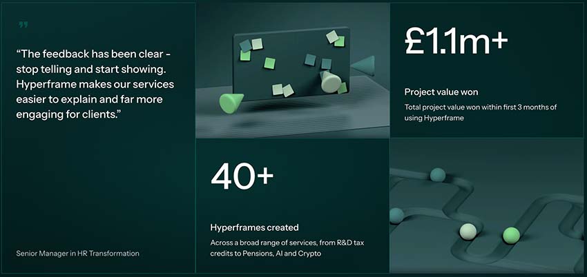
It’s not just consumer brands that benefit, either. In professional services, where ideas are often complex and abstract, clarity is everything. When a Big 4 professional services firm used Hyperframe to visualise and explain their services, they didn’t just make their message clearer - they made it compelling, which resulted in them winning over £1.1 million in new business. Proof that when your audience understands your value, they act on it.
When It Goes Wrong (and What We Can Learn)
Of course, not every story has a happy ending. For every sleek rebrand or perfectly pitched presentation, there’s a cautionary tale lurking in the archives of the internet - proof that one small design choice can change everything.
You’ve probably seen a few floating around: logos that look unintentionally rude, symbols that mean one thing in your head and something very different on paper, or marketing visuals that spark confusion instead of connection. It’s funny - until it’s your logo.
Take the now-infamous Instituto de Estudos Orientais logo. It was meant to represent a pagoda in front of a rising sun, but unfortunately, it looks… well, a little too suggestive once you see it. It became a viral lesson in why you should always, always test how your visuals might be interpreted by fresh eyes.

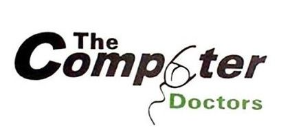
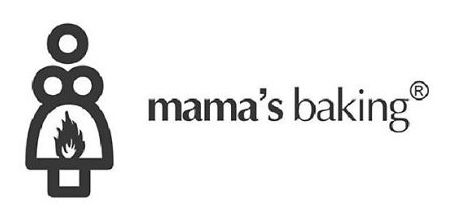
Other classics include The Computer Doctors, whose questionable placement of a mouse cord created quite a different image than intended, and Mama’s Baking, where some unfortunate positioning formed an… unfortunate silhouette.
These examples might make you laugh, but they also highlight something serious: when visuals misfire, meaning gets lost. Whether it’s an accidental double entendre or a cluttered slide deck, the result is the same - your audience stops listening.
It’s All About Connection
At its heart, great visual communication isn’t about design trends or fancy animations - it’s about connection. It’s how you bridge the gap between what you know and what your audience needs to understand.
When visuals work, they do more than grab attention - they build trust. They turn complexity into clarity, hesitation into confidence, and confusion into “oh, I get it.” That’s the power of showing, not just telling.
Whether you’re crafting a logo, building a presentation, or explaining a complex service, the goal is the same: make understanding effortless. When people don’t have to work hard to grasp your message, they’re free to focus on why it matters.
And that’s where tools like Hyperframe shine - helping businesses translate their ideas into interactive, visual stories that clients immediately connect with. Because when your audience sees what you mean, that’s when the magic happens.
Want more like this?
Want more like this?
Insight delivered to your inbox
Keep up to date with our free email. Hand picked whitepapers and posts from our blog, as well as exclusive videos and webinar invitations keep our Users one step ahead.
By clicking 'SIGN UP', you agree to our Terms of Use and Privacy Policy


By clicking 'SIGN UP', you agree to our Terms of Use and Privacy Policy
Other content you may be interested in


Want more like this?
Want more like this?
Insight delivered to your inbox
Keep up to date with our free email. Hand picked whitepapers and posts from our blog, as well as exclusive videos and webinar invitations keep our Users one step ahead.
By clicking 'SIGN UP', you agree to our Terms of Use and Privacy Policy