9 Steps to Improving CRO


Often part of ‘CRO’ (conversion rate optimisation) strategies, reviewing and improving UX functions is important – but an important page that you might be overlooking is one that’s an untapped goldmine for clicks and conversions…Your product listing page.
Listing pages act as a gateway to your product pages. And when optimized right, they can help you convert more visitors into customers.If a visitor is already browsing through your product listing pages, it means that they’re interested in your online store. So this is where you lead them to product pages and persuade them to buy.
With minor improvements, you can start driving more visitors to your product pages and increase your conversions.This article lists new UX and functionality which has been recognised across leading eCommerce retailers' websites, and we suggest as value-adding functionality for the purpose of increasing customer engagement and conversion rate. These functions are focused solely on the PLP.
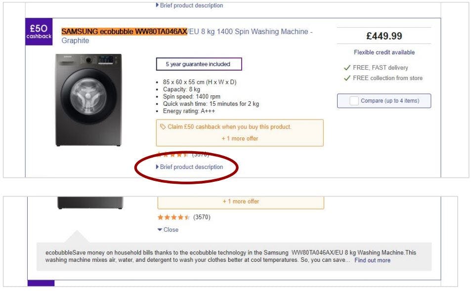
Inline Descriptions
On the PLP layout, insert the short product description, hidden inside a drop-down box. This gives further product info to the customer without them needing to leave the page. This really only works when a product tile fills the full width of a row.
The ‘find out more’ link (within the description text) should click through to the PDP, just like the product image does.
Collapsed Filters
Horizontal filtering has become a common trend since 2018, with many retailers now designing their PLP page full-width – this allows for more product columns (e.g. the below shows 5 tiles per row). We have recognised many retailers are tidying this area and collapsing all filters within a single “Filter” drop-down.

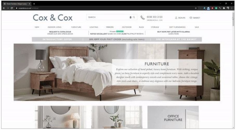
Merging Content & Product Listing Pages
Insert content landing page above the PLP layout. This is blending lifestyle brand content and product content almost seamlessly, easily achievable if your product imagery is shown in a situation.
Timeline Product Recommendation Carousels
This ‘recently viewed products’ carousel adds a label to products which are already in the user's basket, and also shows a timeline of when products were viewed. The user can look through their history, and easily find the product they were looking at on a particular date.
The user can also clear their history, so other users of the same browser will not see the products they viewed.

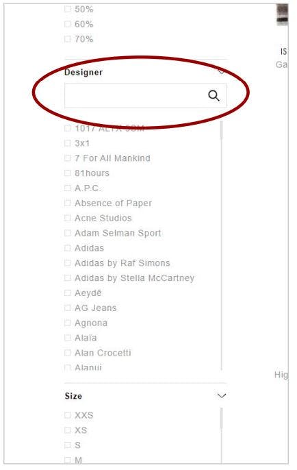
Filter Search Box
When a list of filter attributes is longer than 30 options, a user will get frustrated at not being able to find the particular option they are looking for. A search box which filters the list below it, with type-ahead functionality so the list filters as the user starts to type.
Sticky Horizontal Filters
As the user scrolls down a PLP, the hor1izontal filters should be kept on-page so the user can continue filtering without needing to scroll up to the top of the PLP. The header is normally a ‘sticky’ element but this can be replaced by the filter row when on PLPs.

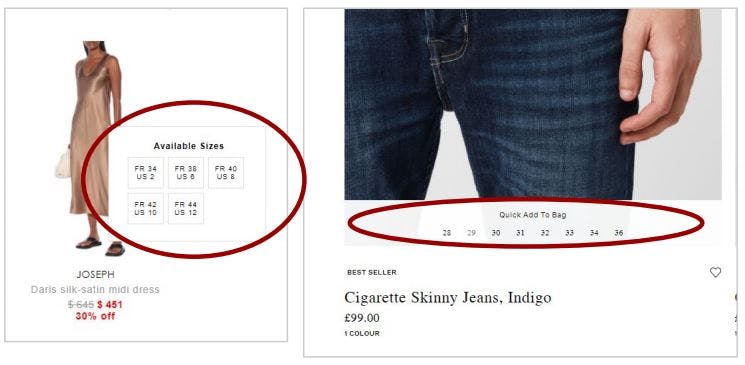
On-Hover Add-to-Bag
Some clients have a strong performance from add-to-bag functionality, whilst others don’t. We have recognised many retailers showing this data when the user hovers over the product tile, instead of it being hidden inside a pop-up or inline modal.
This functionality gives the user quicker insight into availability and requires less interaction than clicking an icon to see it.
Maximise View-By-Columns
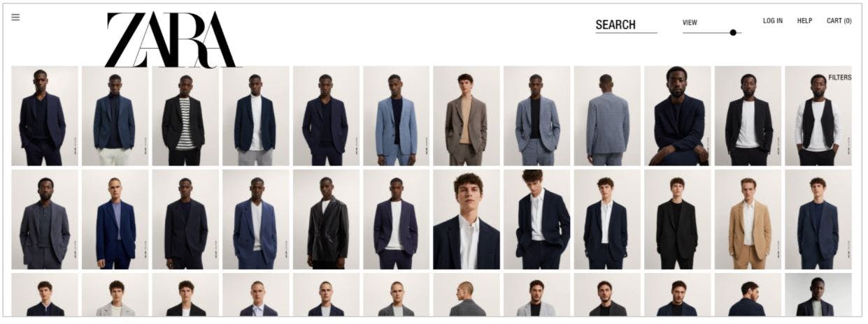
Known within the UK eCommerce industry for its outlandish and fascinating UX functions, Zara has always pushed boundaries with their customer-facing website features.
This particular function, allows the customer to maximise the number of product tiles viewed on a single row. 12 columns can be seen on their maximum view, which feels very much like B2B functionality for viewing many product SKUs simultaneously.
Personalise Using Similar Images
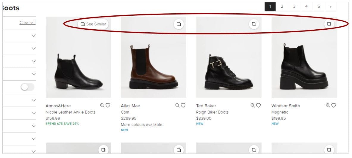
This function (spotted on The Iconic) is a dynamic merchandising sorting option, which uses the product information of the particular product tile selected, to merchandise the category being viewed.
This personalisation function is incredibly useful for customers who do not wish to use the conventional ‘filtering’ system.
For more useful information on best practice for your eCommerce performance reporting visit Remarkable Commerce website and get in touch!
Want more like this?
Want more like this?
Insight delivered to your inbox
Keep up to date with our free email. Hand picked whitepapers and posts from our blog, as well as exclusive videos and webinar invitations keep our Users one step ahead.
By clicking 'SIGN UP', you agree to our Terms of Use and Privacy Policy


By clicking 'SIGN UP', you agree to our Terms of Use and Privacy Policy
Other content you may be interested in
Categories
Categories
Categories

Want more like this?


Want more like this?
Insight delivered to your inbox
Keep up to date with our free email. Hand picked whitepapers and posts from our blog, as well as exclusive videos and webinar invitations keep our Users one step ahead.
By clicking 'SIGN UP', you agree to our Terms of Use and Privacy Policy


