Data Reporting 101 for Marketers


Data reporting is an essential part of any marketer's job today. But if you aren't comfortable with math, or analysis tools, it can seem a bit overwhelming. We've put together a guide to help you navigate this world.
Data reporting. Two words that most marketers – who aren’t also part-time data analysts – dread. So many numbers, so little time.
What Is Data Reporting And Why Is it Such an Integral Part of a Marketer’s Job?
Let’s face it, most marketing courses in universities are not particularly strong on data representation.
But we’ve got you covered.
Ask (Veezoo) and you shall receive…the answers.
Data reporting and representation doesn’t have to be scary – in fact, it can be your best friend (according to McKinsey). You can test the efficiency of your marketing channels. What’s working, what isn’t, what has room for improvement and what shows potential for expansion.
Marketing today is all about testing and adapting based on the test results and this is actually a good thing (really!). You can see the direct impact of your efforts and the value you add to your organization. The internet really is beautiful.
But while we’re on the subject, there is a lot of noise out there – meaning there are a lot of unnecessary data reports that may be monopolizing your time but not really helping you reach your objectives. For instance a report showing the number of impressions that a particularly good LinkedIn creative garnered will probably not be useful if you’re looking at the number of Enterprise leads that the same campaign brought in. In fact, the two are totally unrelated. That’s an overly simplistic example, but this is where data reporting and representation can get hard and cluttered – if you’re looking at the wrong numbers or worse, if you don’t know where to begin.

Reporting Data Doesn’t Need to Be Hard….
Reporting and representing data doesn’t need to be hard. Marketers simply need to go back to the basics. Here are a few things to consider while planning a stellar marketing data report.
Select your KPIs: Let’s start with “the why”. Why are you looking at data reporting? What is the objective? Are you trying to prove that a particular marketing channel is better suited to enterprise leads rather than SMB? Or are you going for more of a brand awareness approach? How many people know about your organization, as a result of a particularly viral marketing campaign?
It is important to distinguish between the two because both might have completely different metrics associated with them. For example, for a campaign geared towards enterprise, what you could consider focusing on is:
- Number of enterprise leads ( based on size of company/ revenue)
- Job title of leads
- CTR
- Cost/Lead
And some more KPIs like this.
For a campaign around brand awareness, you may want to consider something along the lines of:
- Total engagement (likes+shares)
- Number of impressions
- Press mentions ( if any)
- Impression share / Country
There is no one size fits all, which is why it is pretty important to go for the right set of metrics.
Consider your audience: Who is going to see the data? It is important to remember who you are presenting to. If your audience is your manager, by all means, your data reporting needs to be highly detailed and thorough. But if you’re presenting to your head of Sales, maybe all you need to do is stick to the basics and the metrics that are most relevant to him – eg. value of pipeline, number of Sales opportunities etc. You can of course have different data representations and reports for different people.
Data Quality: Now that you have decided on the metrics to track and who you’re going to present it to, it’s important to capture all the data points. For instance, if it is an AdWords campaign, is your conversion tracking set up correctly? If not, that’s something you need to sort out. This would determine the numbers not only on your report, but also on your AdWords account. And these numbers are useful data-points for the learning period for Google’s algorithm. Therefore capturing all the data-points with the right level of accuracy is an important step.
Data Representation : Another very important factor is the type of visualization that you choose to represent your data. What goes best? A bar graph? A pie chart? Stacked bar graph? It’s important to make sure that you switch things up a bit to find the visualization that best represents your data. It is quite likely – if your dashboard is looking too cluttered or too confusing that it may just be a matter of choosing another type of data visualization.
Despite having all of the above sorted out, it’s really important to test it out. For instance, if you’re creating a dashboard, it’s also important to ensure that it is visually appealing, while still making sense.
Here’s a video from our Co-founder and CTO, JP Monteiro which shows you how easy it is to set up a dashboard using Veezoo, but also following up on the KPIs you’ve chosen, so as to stay agile.
It’s important to stay flexible and not simply rely on pre-defined dashboards and metrics to draw conclusions and insights. Try our chat-based interface to see how easy it is to get insights sans dashboards!
Are Dashboards REALLY that Great for Data Representation and Data Exploration?
Don’t get us wrong. At Veezoo, we love Dashboards as much as the next person. In fact, that’s why it’s so easy to make dashboards with our tool – in just a few clicks, you can have a pretty in-depth dashboard. But, it is important to recognize the limitations of dashboards as well.
Dashboards are great when they gather the most important questions that will still be relevant next week, next month or next quarter from now. These are usually your main KPIs, which you want to look at with a certain frequency. The best analogy is your car’s dashboard, which shows you the speed, your fuel gauge, rotation speed, etc. You will always want to look at it while you are driving, because it quickly tells you if something is off. For your business, your dashboard needs to also give you an overview of your KPIs and tell you if something is off. But it won’t necessarily tell you why something is off. Whenever we’ve seen companies create reports to look for all the possible causes of a spike or drop, we’ve seen confused business users, lost in a jungle of dashboards. You need to have an easy way to find the reason why, let’s say, there was a big jump in clicks this morning. This means going beyond predefined dashboards.
Also, what about questions that are super important for a discussion today, but you don’t really want to look at them again next week? For instance, when discussing your content strategy, you realize you don’t really know what was the social post with the most engagement last month. That may trigger further questions like: was this engagement particularly high compared to the rest of the month? Or maybe you want to check other posts about the same topic to see if they show the same pattern. Unless your data team hired a soothsayer or fortune teller, there is no way they can create dashboards for all of these questions in advance. And even if they did, finding the right report and verifying if it is about what you expected can quickly become a challenge in itself. The truth is: not every data question is a nail that needs to be hammered with a dashboard.
So what does this “going beyond dashboards” mean? The name for it is self-service analytics. To make it clear for you, let me illustrate it with an example, using Veezoo.

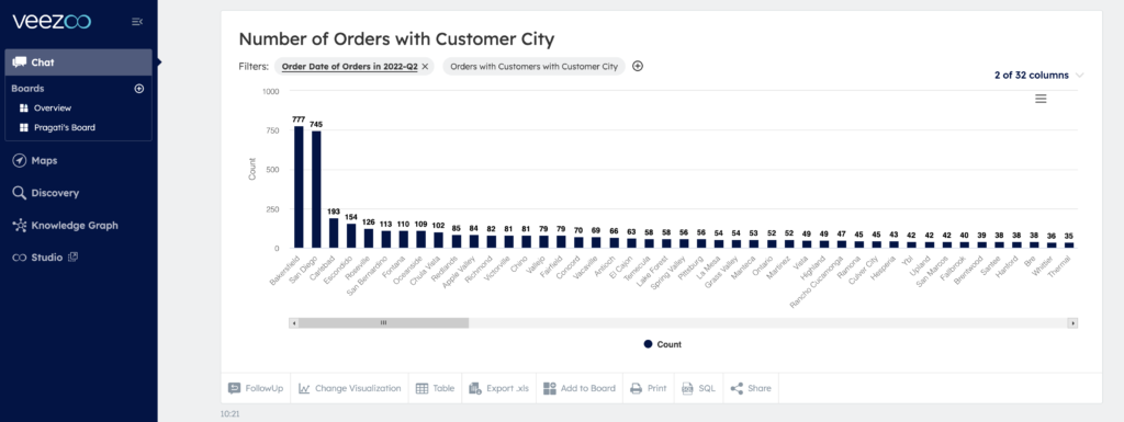
I chose our e-commerce data set here and asked Veezoo which city had the most number of orders last quarter?
Answer: it was Bakersfield.
Great, as usual, Veezoo also followed this up automatically with a graph of the top cities in terms of number of orders in Q2:

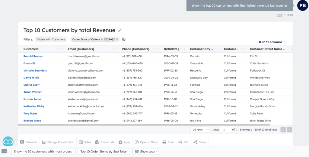
But, I was interested to know where I should focus my efforts to get more revenue. So I asked Veezoo to show me the top 10 customers in terms of revenue they brought in last quarter.
As per this list, none of them are based in Bakersfield!
Bet you didn’t see that coming.

But I do see that two of them are in San Diego– which is the city with the 2nd highest number of orders.
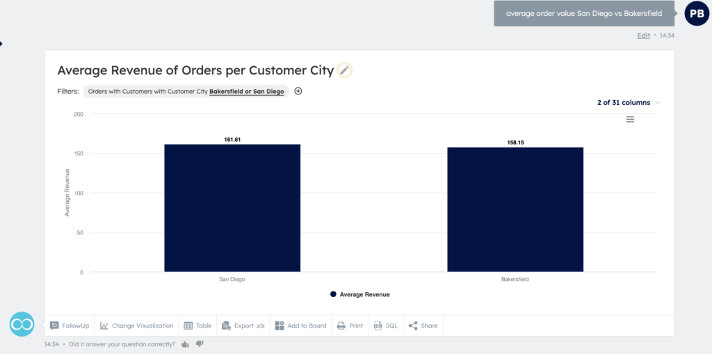
So I decided to check the average order value for San Diego vs Bakerfield:

And it seems indeed that on average our San Diego customers are spending more.
Now, a simple dashboard would have shown us the number of orders per city and Bakersfield would have been the star of Q2 2022. Which is great – but we’d probably have missed an important opportunity to see which city brings in the most revenue per customer.
It always depends on your goals and what you want to achieve/track. But that’s why the flexibility to explore your numbers easily is necessary to set you up for success, whatever your goal is.
Storytelling Via Data Representation
Your data is only as good as the story you’re telling with it. Think about it, the best powerpoint presentations are the ones which are highly visual and do not have a lot of text associated with them. Same goes for websites – at least half the story, so to speak, comes via the visualizations.
So, while data is important, you have to pick and choose the data you want to use in order to tell a story. Or, you could just use Veezoo and let our tool pick out the visualization that best represents your data.
Noone wants to sort through a bunch of data which is hard to make sense of. You want something that is easily understandable and also highly visual. Here are some data representation/visualization tips and tricks that can help you go a long way:
- For comparisons of a certain metric over different periods of time, you can use either a bar graph or a line graph. I personally use bar graphs because it is easier for me to understand each data point with this. This can be something as simple as Sales made every month – a bar graph is easiest. You can also go a bit deeper here by using a stacked bar graph – eg. sales made every month in the top 3 regions, with each region being represented by a different color.
- To represent a share of different parameters – such as the share of pipeline from your top verticals- a pie chart would work best. It’s clear, concise and you can split it up easily, while still keeping it visually appealing. What’s not to like about pizza?
- To represent a marketing funnel or a sales funnel, it’s actually easy – all you have to do is use a funnel to represent the different stages. Not only does it make it simpler to understand each stage of the funnel, it’s also useful to represent the conversion rates between each stage.
These are just a few, very basic data representations – but they all have one thing in common, they’re designed to tell a story that doesn’t need too much interpretation or time to understand.
At Veezoo we understand that data visualization is not everyone’s cup of tea – it definitely isn’t mine. And that’s why our tool picks out the best visualizations for your data. At the same time, you have the ability to change the visualization to better suit your needs if the one automatically selected by the tool doesn’t work out for you.
When Data Reporting Isn’t Going Your Way
Now that we’ve covered some of the basics of data reporting, let’s talk about when the data isn’t showing a favorable trend.
It’s happened to all of us – and while this might start filling people with dread, it’s no cause for concern, but more an indicator that something needs to be optimized or changed. Also, marketing is pretty unpredictable – there is no one-size fits all. Something that may have worked before, is probably not going to work multiple times. Think about it – Google is constantly updating its SEO algorithm, so even SEO cannot be done the same way today as it was done as recently as a couple of years ago. The same goes with almost anything in marketing.
But having covered that, it’s important to actually double check whether your report is valid when the data doesn’t add up:
- Is all of your data in the report? Or is your data not automatically synced to show the latest numbers. It may sound silly but the timeline is often to blame. You may be looking at incomplete data in your reporting matrix.
- Are you interpreting the data correctly? It’s possible that you’re just not seeing things the right way.
- If the results are not as expected, it’s important to understand that this could just be a failed experiment and failure is not a bad thing. In fact, Amazon actually encourages its employees to fail fast!
So to summarize, data representation and reporting may not be everyone’s cup of tea at the outset. Plus, a lot of the tools out there can be intimidating – MS Excel might be very useful, but it’s definitely not the easiest thing to understand. The silver lining is that it gets better with time – or if you have a shortcut in the form of an extremely user friendly tool that requires no training or coding knowledge.
If you need a help with data representation and reporting, then don’t hesitate to reach out.Your Free Access to Veezoo is Waiting! Sign up today!
Want more like this?
Want more like this?
Insight delivered to your inbox
Keep up to date with our free email. Hand picked whitepapers and posts from our blog, as well as exclusive videos and webinar invitations keep our Users one step ahead.
By clicking 'SIGN UP', you agree to our Terms of Use and Privacy Policy


By clicking 'SIGN UP', you agree to our Terms of Use and Privacy Policy
Other content you may be interested in
Categories
Categories
Categories
Categories

Want more like this?


Want more like this?
Insight delivered to your inbox
Keep up to date with our free email. Hand picked whitepapers and posts from our blog, as well as exclusive videos and webinar invitations keep our Users one step ahead.
By clicking 'SIGN UP', you agree to our Terms of Use and Privacy Policy


