Stand Out in the Inbox this Black Friday - 7 Ways


Marketers are constantly challenged to standout in a crowded Black Friday inbox. As read times for emails decline as customers are bombarded with marketing messages, how can brands standout and promote engagement with their campaigns?
Sarah Sherwood, RedEye’s Creative Design Manager knows a few things that can help brands overcome an crowded inbox, with the answer lying in the use of interactive and personalised content to promote high engagement and cut through the noise of the Black Friday event. In this article, Sarah breaks down her top ways to achieve this with examples from some of the best in the business.
1. Carousels
Emails are becoming increasingly interactive as an on-going trend away from outdated static creatives.
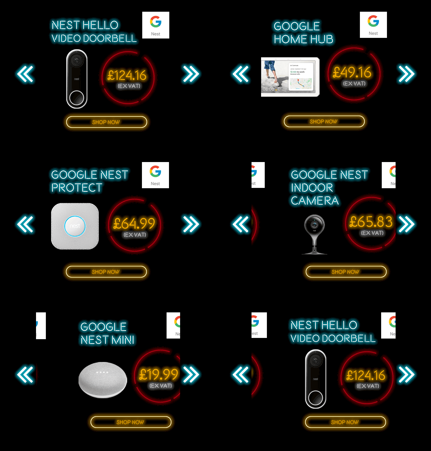
Carousels offer a visually compelling element to encourage interaction in the form of swipes and tabs to engage a customer for longer, increasing the likelihood of click-through. This also provides brands the ability to showcase more of your product range within one email, vs a traditional static image.
Try using carousels to showcase different sizes, popular offers, trends or categories as part of your campaign. City Plumbing Supplies used this to full effect during their Black Friday campaign.
2. WhatsApp sharing
Customers during Black Friday want to share the best offers and promotions with family and friends. Try expanding the reach of your campaign via WhatsApp, the UK’s most popular messaging service (Hootsuite, 2019).
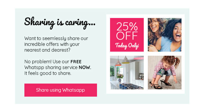
Imbed the ability for customers to share vouchers or offers during Black Friday with WhatsApp sharing in your campaigns.
Customers can seamlessly be taken directly from your email to WhatsApp to share vouchers codes or offers with friends, family or groups. An easy way to reach more potential customers through using the advocates of your existing customers.
3. Remind Me
Black Friday is an unpredictable time, customers are busier than ever Christmas shopping, putting up the tree or seeing family and friends.
This makes them even harder to pin down. Deciding on the optimal send time is difficult, even with plenty of testing a percentage of customers could miss out.
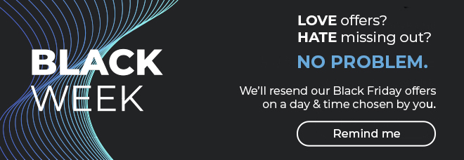
Remind Me allows a customer to resend a copy of an email to themselves at a date/time that suits them. A ‘Remind Me’ banner is added to your email creative which links to a ‘Remind Me’ microsite.
At this point the customer can select a time and date when they want to receive an email or SMS reminder at a time convenient to them.
The reminder email or SMS is designed to recapture the customer’s attention at a time that suits them, making them more likely to engage and convert from your Black Friday campaign.
4. Toggle
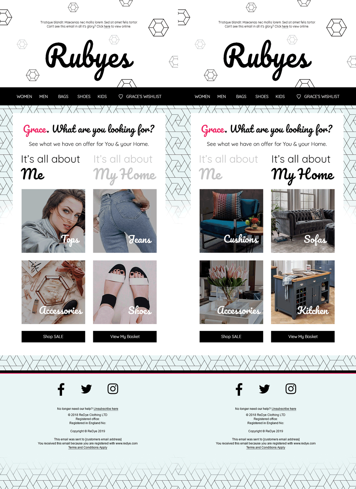
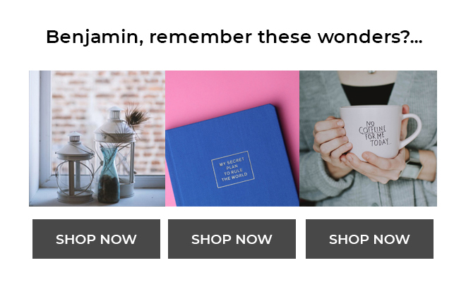
Toggle buttons can bring your creative to life allowing you to showcase different content based on how the user interacts with your creative. Toggle buttons can be used to allow users to alternate images or change the entire email creatives.
Just some of the ways you could use a toggle button over Black Friday could include displaying different products or colours, allowing customers to select whether they are buying for themselves or gifting, or perhaps just toggle to unlock the Black Friday prices.
In the below example, customers can toggle between products for themselves or their home using the toggle button.
5. Dynamic & Behavioural Content
Many marketers are overwhelmed with the level of dynamic content that can be used to personalise an email creative.
Define a library of dynamic content you want to use during the Black Friday to make it easier to manage across all of your campaigns. These rules should support what you want to achieve over peak period and drive relevance for your campaigns.
Consider the data you hold at a person level, onsite behaviour (such as last browsed category or item) and segment level and use what will add the most relevance for your brand.
This will then aid your design process to help you consider what elements you should change within your creative, whether this is banners, offers or text changes to closer align and personalise your email to the individual customer.
6. Scratch & Reveal
Build excitement as the customer reveals your Black Friday offer using scratch and reveal to increase engagement and the uptake of discount codes or incentives. Papa Johns Cyber Monday campaign used this to full effect as customers unlocked their 40% off discount code.
7. Hotpots
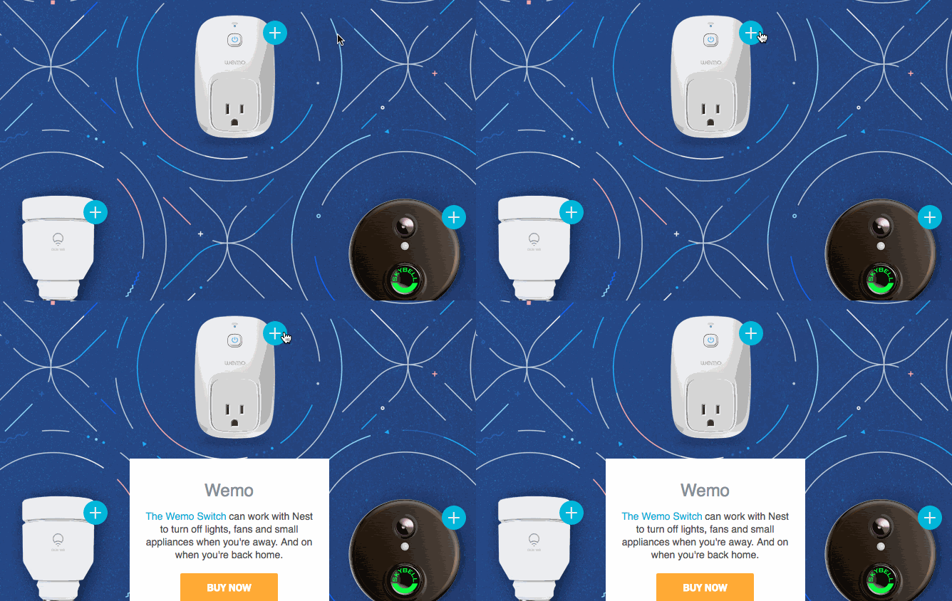
Interactive Hotspots allow customers to interact with images and reveal extra information about product range or features right from within the email in a smart way. This is a more beneficial experience for the customer rather than of being taken away to a website page to find out more.
If that customer is then interested, each Hotspot has a unique link to the product or content on your site to make the purchase experience more seamless.
Hotspots are also fantastic way to promote product ranges with additional information about individual products, or interact to highlight technical product features.
Nest use Hotspots to allow customers to interact with different products from the Nest range. Customers see additional information about the product with a buy now button specific to that Hotspot.
Want more like this?
Want more like this?
Insight delivered to your inbox
Keep up to date with our free email. Hand picked whitepapers and posts from our blog, as well as exclusive videos and webinar invitations keep our Users one step ahead.
By clicking 'SIGN UP', you agree to our Terms of Use and Privacy Policy


By clicking 'SIGN UP', you agree to our Terms of Use and Privacy Policy
Other content you may be interested in
Categories
Categories
Categories

Want more like this?


Want more like this?
Insight delivered to your inbox
Keep up to date with our free email. Hand picked whitepapers and posts from our blog, as well as exclusive videos and webinar invitations keep our Users one step ahead.
By clicking 'SIGN UP', you agree to our Terms of Use and Privacy Policy


