Five Rebrandings that Worked


Embarking on a rebranding journey is a daunting prospect for brands. It takes care and dedication to transform your identity and perspective. But the results can be striking and have your audience talking nonstop about your new look.
We asked five creative friends to tell us about their favorite rebrandings of 2023. The result was a list of stand-out successes — and one famous fiasco!
Burberry
With Freddie Öst, Founder & Brand Director at SNASK
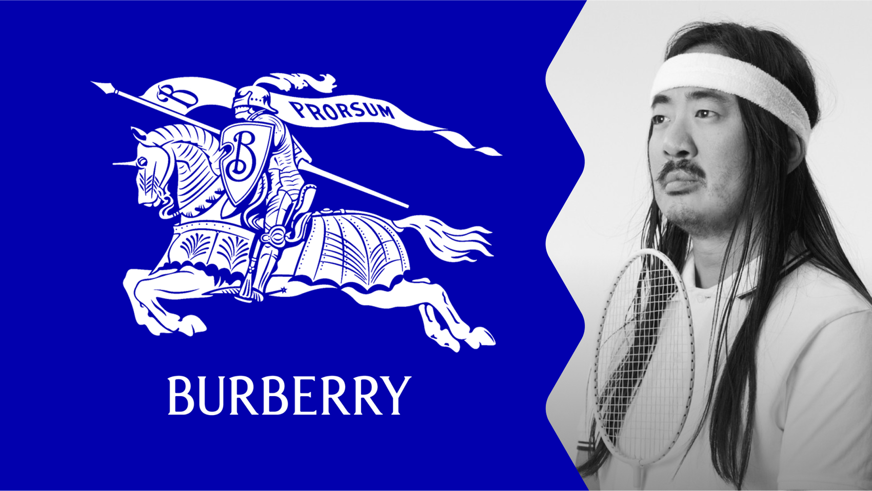
Burberry’s rebranding journey hinged around a fascinating new logo and identity that has its roots in an old stamp found in their archives. The stamp, a monogram logo from creator Thomas Burberry, formed the foundation of the fashion brand’s new look, which was spearheaded by their new Chief Creative Officer, Daniel Lee.
“They were one of the first major lifestyle brands to break the horrible trend where brands went more generic and minimalistic. To the point where most of them looked exactly the same. It's against that background that this shift in brand identity becomes interesting and refreshing. Burberry, once again, adds details to their wordmark, heritage knight symbol that is taken back, and a cobalt blue color that is far away from their red, black, and beige tartan pattern.” Freddie Öst
Eurostar Group
With Greg Althoff, Design Director at John Knowles Ritchie
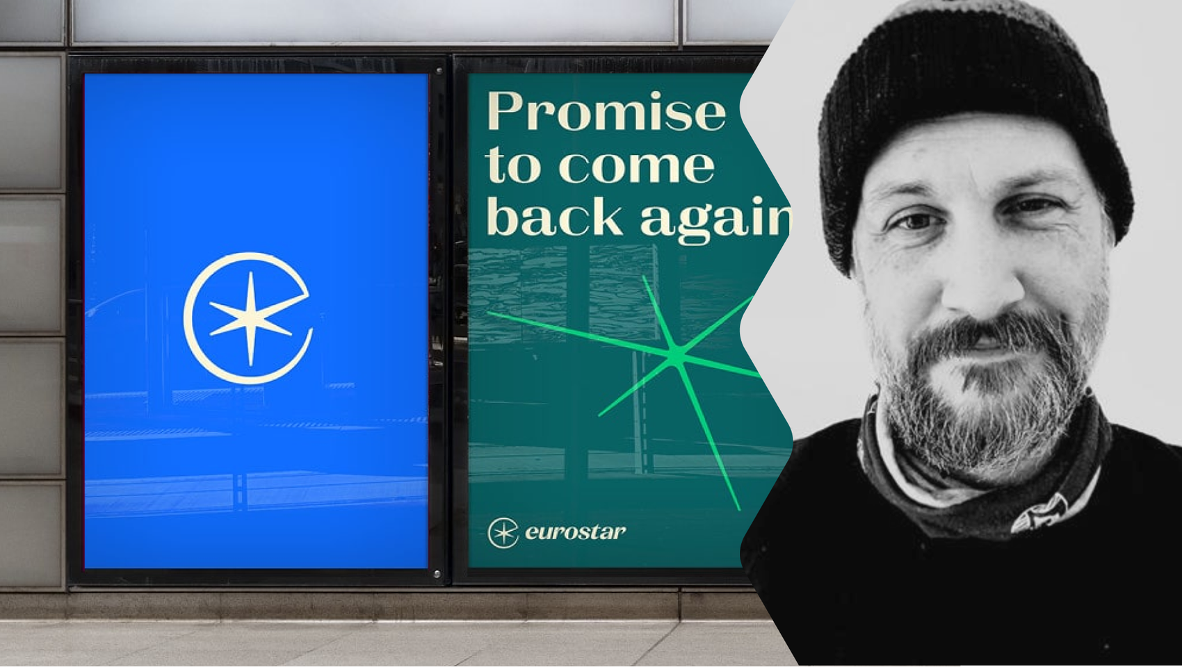
Following the merger between Eurostar and Thalys in May 2022, the newly formed Eurostar Group looked to rail history for inspiration about their rebranding. Harking back to an earlier brand identity for Eurostar was a bold move, but bringing the “spark” element forward by 30 years has provided the brand with a centralized logo to use in advertising, digital marketing, and physical branding.
“I really love it when a redesign brings out the true essence of a brand more than ever. That's why I'm a big fan of how DesignStudio reimagined Eurostar to reflect the brand it has always aspired to be. The way they animated the spark is probably one of my favorite things I've seen in 2023. It's the kind of work that demonstrates to clients what's truly achievable. I wish every American airline would look at this work and kick off a rebranding assignment!” Greg Althoff
With Felix Damerius, Executive Creative Director at Peter Schmidt Group
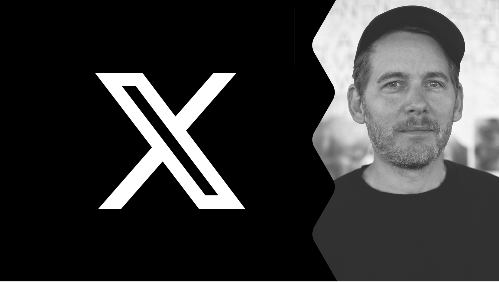
X, the tumultuous new look for Twitter following Elon Musk’s takeover of the company, is famous like the Titanic. The power move by rich kid Musk is a parable for how — and why — not to embark on a rebranding. It undeniably caught the attention of the public, and nobody can argue it wasn’t impactful — although it lacked in depth what it made up for in noise.
“Love it or hate it, it's definitely one of the most radical relaunches of the year. A daring move that had an impact beyond our designer bubble and caught the attention of the public. How often did you hear ‘X, formerly known as Twitter,’ this year?” Felix Damerius
EA SPORTS FC
With Mia Berggren, CEO at Uncommon Creative
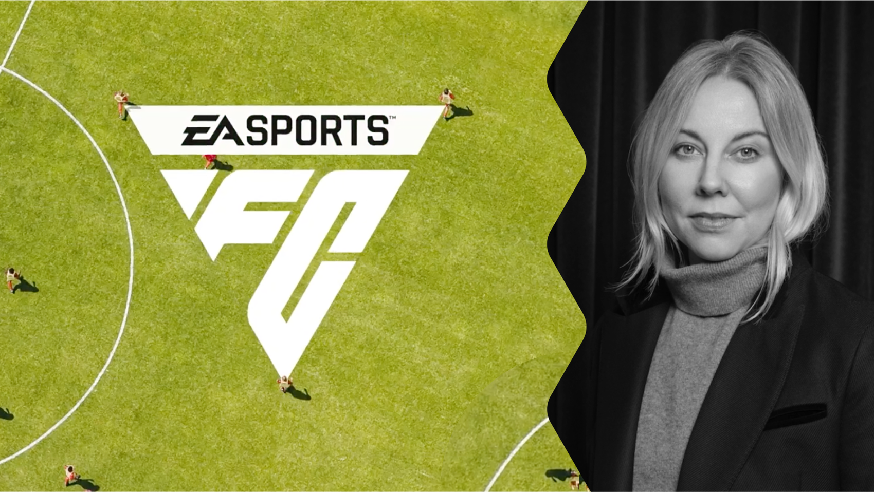
EA Sports has moved in a bold new (or not!) direction with its rebranding journey, taking inspiration from a gameplay element that players have seen for years. The player marker — appearing over whichever footballer the player currently controls — is such a staple of these games that using it as inspiration for the logo is a move of genius.
“The new global brand identity for EA SPORTS FC — WOW! The inspiration, hiding in plain sight for 30 years, is taken from within the game, well known to the fans. A beautiful starting point for crafting something that celebrates me as a gamer with authenticity. Respecting not just the brand but one of the world's most loyal communities in a time of change.” Mia Berggren
Sundance Film Festival
With Jonas Zieher, Founder & Creative Director at ACRE
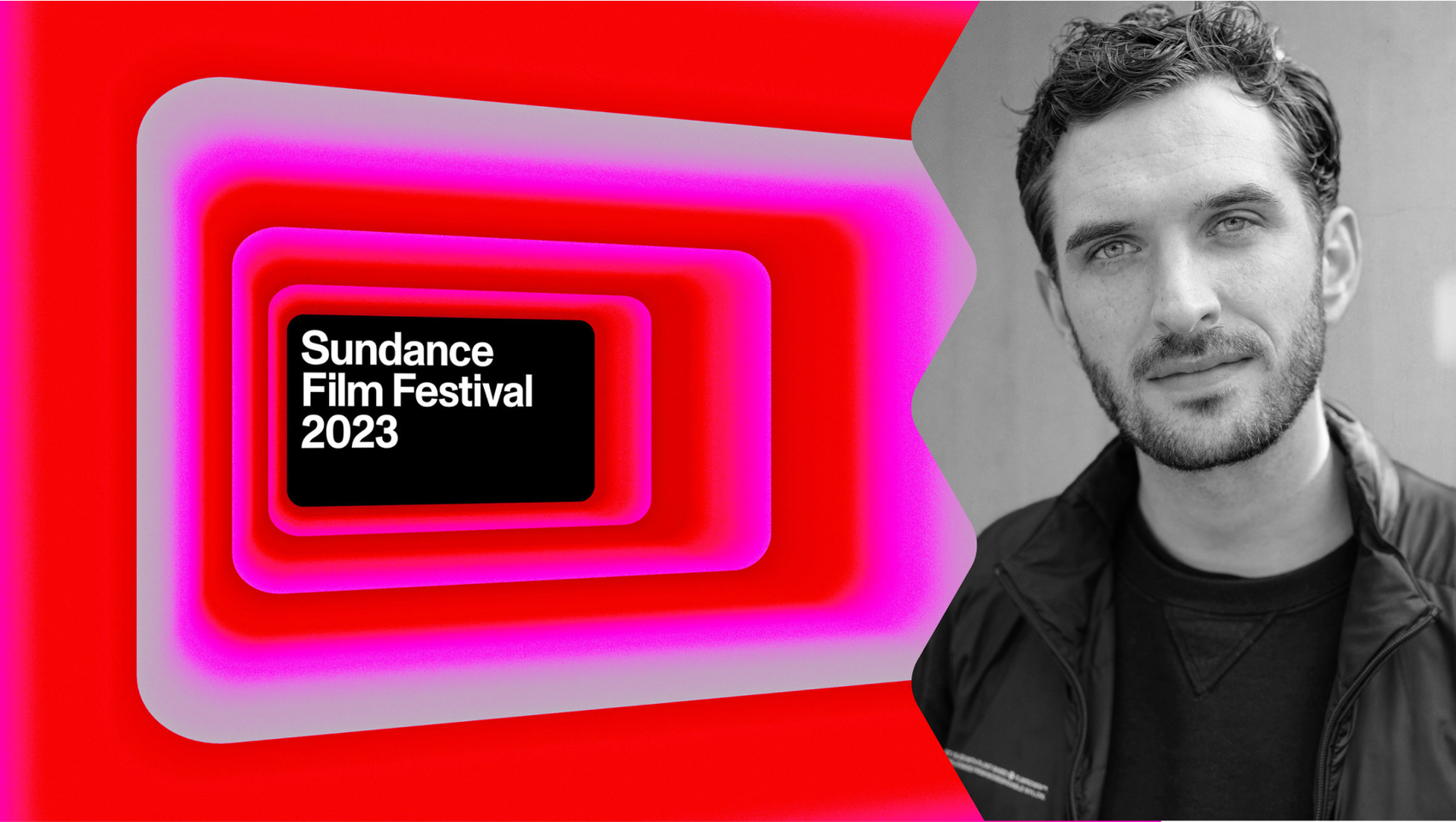
For many brands, their annual brand refresh is an established tradition. Like Pantone’s Color of the Year, the Sundance Film Festival would create its identity each year. Now, though, the long-running film festival in the US wanted a concrete identity that could live on. The unusual 16:9-ratio logo ties in really cleverly with the brand’s focus on independent movie creators and can act as a framing device for the filmmakers and artists that the festival showcases.
“Since its inception in 1985, the Sundance Film Festival underwent a total identity overhaul year after year. On the face of it, this seems like a great idea, flowing with the pace of the ever-changing world of film, making way for new ideas every year. Faced with the challenge to scale the festival and build long-term brand equity, Porto Rocha’s rebrand has now introduced a more systematic approach, giving the festival a 16:9 frame as a recurring graphic device. Present throughout the duration of the year, not just during the festival, the frames hold a range of diverse content. This is an interesting example of how design can inspire much-needed long-term thinking in a time in which our attention spans barely last a TikTok post. “ Jonas Zieher
Inspired to embark on your own rebranding journey? Read our rebrand rollout guide for how to implement your new identity.
Want more like this?
Want more like this?
Insight delivered to your inbox
Keep up to date with our free email. Hand picked whitepapers and posts from our blog, as well as exclusive videos and webinar invitations keep our Users one step ahead.
By clicking 'SIGN UP', you agree to our Terms of Use and Privacy Policy


By clicking 'SIGN UP', you agree to our Terms of Use and Privacy Policy
Other content you may be interested in
Categories
Categories
Categories
Categories

Want more like this?


Want more like this?
Insight delivered to your inbox
Keep up to date with our free email. Hand picked whitepapers and posts from our blog, as well as exclusive videos and webinar invitations keep our Users one step ahead.
By clicking 'SIGN UP', you agree to our Terms of Use and Privacy Policy


