7 Examples of Great On-Site Search


On-site search is a critically important element for pretty much all eCommerce websites and when not optimised or set up correctly, a consumer who interacts with the function can be led to believe the retailer does not offer the service or product they desire. We have scoured UK eCommerce retailers to find a selection of good, well-optimised engines and also bad, unusable versions.
There are a plethora of reasons why a website user would interact with an on-site search, sometimes search is popular because the overall site UX is not optimised and so search helps people get places faster. Other times, users do not know what area or category of the website a product/service might be listed within, therefore using a search tool may give them inspiration and direction. However, typical users who engage with an on-site search tool tend to convert at a much higher rate – this can sometimes be 10x higher than the website's average conversion rate. This impressive data puts high importance on this area of an eCommerce website and requires the search engine to be intelligent, useful and engaging to yield the best possible rate of conversion.
This issue becomes even more apparent when looking at mobile eCommerce on-site search experiences, which are frankly disgraceful. You probably didn’t need a study to prove that out.
First, we look at a selection of retailers who have well-optimised, fully functioning on-site search tools
Good examples of site search
1 - Wayfair
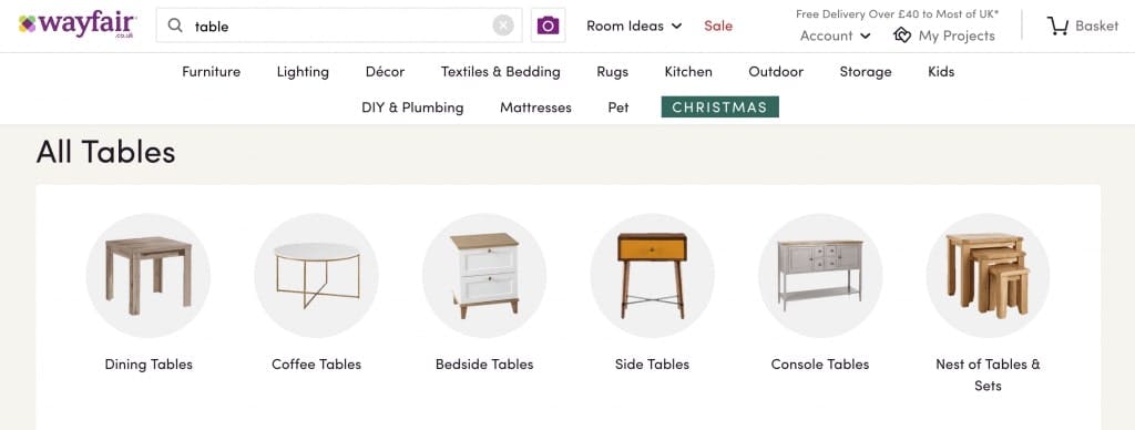
In general, Wayfair’s navigation and use of content to direct consumers around their site is particularly engaging and useful, which reduces the need for a user to use the search function. However, when a user’s natural instinct is to behave in a particular way there is little possible a retailer can do to stop them, instead they are best focusing on how to make their journey better. The first observation is the implementation of exact and fuzzy matching redirects to appropriate categories. Searching for ‘table’ triggers an automated redirect to the ‘All Tables’ category:
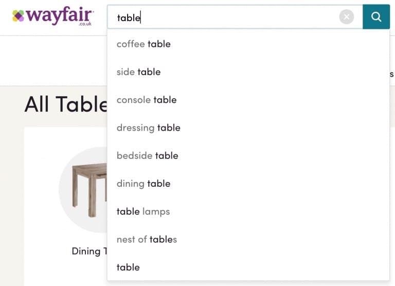
Additionally, Wayfair’s auto-suggestions which are listed when typing are matching on darkened parts of the word, here you can see relevant suggested search phrases with the matched word in black font.
2 - Schuh
Although Schuh’s search function is not as ‘in-you-face’ as others with a simple icon within their header, their implementation is arguably stronger with product suggestions as well as category links – this is more inspirational for a customer but also distracts from the much larger range of product available.
Searching for ‘Vans’ delivers two product suggestions within the search panel, followed by a redirect to the merchandised branded category. When the search phrase includes additional parameters like a size or colour, this filters the list further whilst staying on the category.
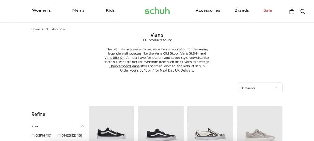
The search function is not as ‘in-you-face’ as others with a simple icon within their header, their implementation is arguably stronger with product suggestions as well as category links – this is more inspirational for a customer but also distracts from the much larger range of products available. Searching for ‘Vans’ delivers two product suggestions within the search panel, followed by a redirect to the merchandised branded category. When the search phrase includes additional parameters like a size or colour, this filters the list further whilst staying on the category.
3 - Moss
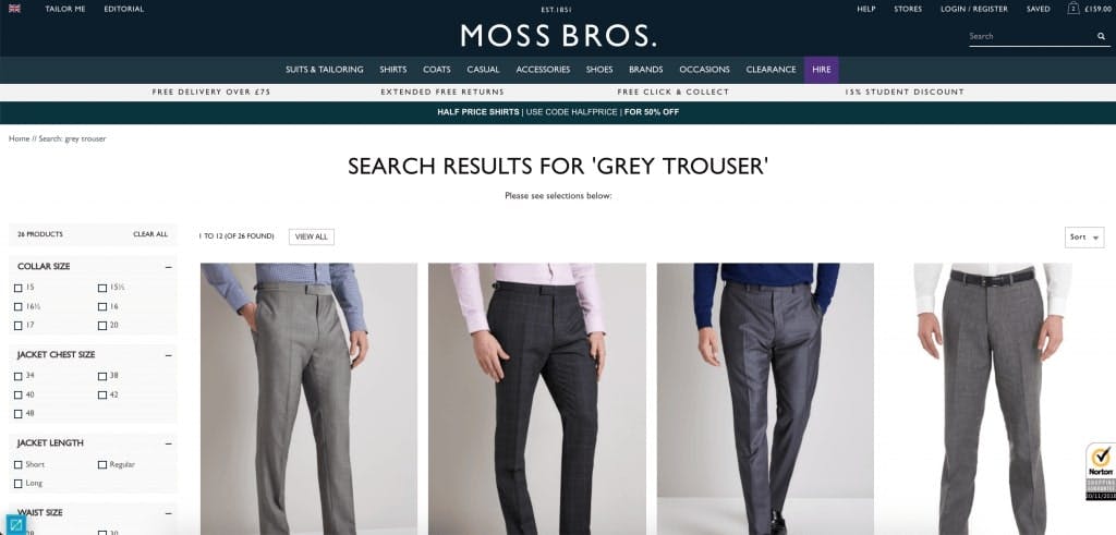
Using the Remarkable Commerce Manager, this high-street menswear retailer control and manage its on-site search functionality and behaviour with ease and do it very well. Moss has implemented hundreds of optimisations on a word-by-word basis, including hypernym and homonym settings, fuzzy-matching and AI-extended product results. A common optimisation for on-site search functionality is reviewing misspellings and filling the gaps to ensure the correct product is shown at all times. In Moss’s case, the difference between ‘grey trousers and ‘grey trousers’ was miles apart before implementing the Remarkable Commerce Manager.
Moss began working with Remarkable Commerce back in 2014 and within the first 12 months saw revenue increase 33%, click here to read more.
Next, we look at a handful of retailers who clearly have some work to do
Bad examples of site search
1 - Clas Ohlson
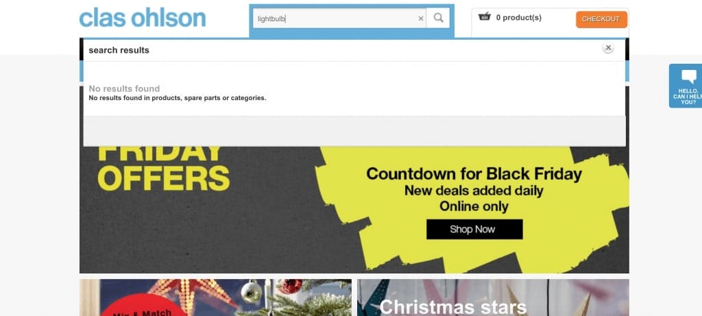
The search phrase ‘light bulbs’ returns 500+ products, yet ‘lightbulb’ only returns 101 products, clearly missing a huge proportion of the list originally shown.
What Clas Ohlson needs to do…
-
Add plural settings to their search tool
-
Implement fuzzy matching for similar or misspells to be caught too
2 - Levi
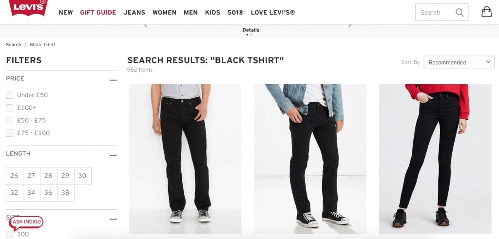
Although known for denim, Levi sells a wide range of products including many a tee. Their on-site search experience has a lot left to be desired, due in most part to their algorithm returning completely incorrect products. The search ‘black t-shirt returns 1,760 results – we have a sneaky feeling that Levi does not have that amount of t-shirts listed individually on their site. Especially as after the first 40 or so products, products in non-black colours begin to appear.
What Levi need to do…
-
Implement fuzzy matching too, for ‘T-shirt’ and ‘t-shirt’ to be seen as the same
-
Add type-ahead functionality with auto-suggestions for a stronger user experience
3 - Skate Hut
At the time of writing, any search including the word ‘black’ redirects to the Black Friday landing page – this includes ‘black t-shirt, ‘Adidas black trainers’ and many, MANY more.
Ignoring this very obvious bug, there are still hundreds of optimisations which can be made to help visitors to SkateHut use and engage with the site easier and for longer. For example, the search ‘skate shoes’ would logically redirect to the dedicated, well-designed landing page – but instead shows a basic, non-retailed category.
What Skate Hut need to do…
-
Add appropriate redirects to exact-match search phrases/categories
-
Enable facet data within the search algorithm, so that colour/size searches apply the correct filters
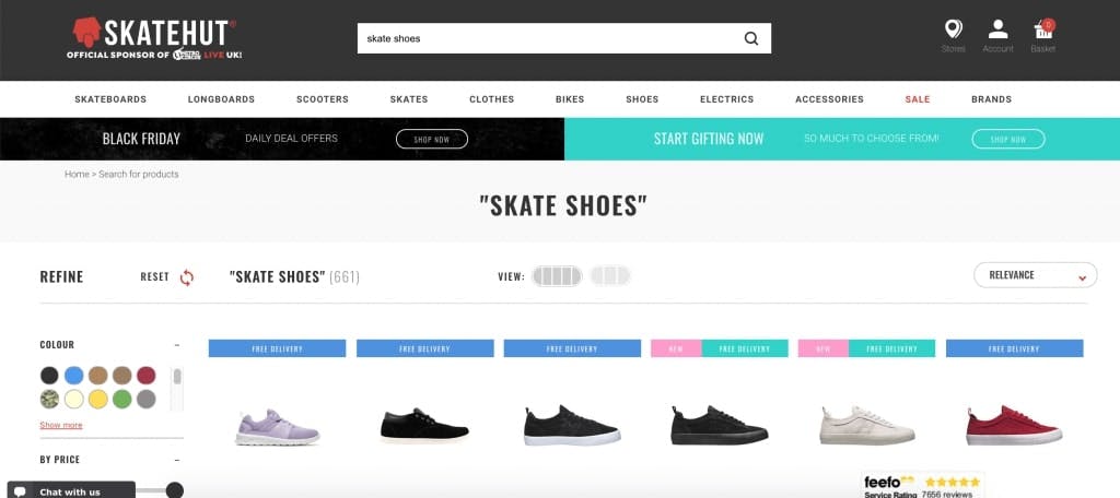
the search ‘skate shoes’ would logically redirect to the dedicated, well-designed landing page – but instead shows a basic, non-retailed category.
4 - Victoria Beckham
Using a unique aesthetic, the Victoria Beckham eCommerce website is super-easy to use and is lightning quick, with an on-site search function which provides product and suggested search phrases similar to the typed term.
What Becks needs to do…
-
Style the ‘View all’ links stronger, so they are not missed
-
Review the algorithm logic so that sunglasses do not appear for trouser searches…
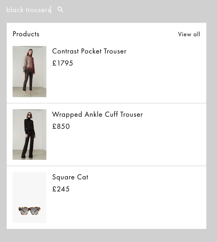
Victoria Beckham’s website shows mismatched product results for the search term ‘black trousers’.
Introducing the Remarkable Commerce Manager…
This article was written by Bradlie Houldsworth, an eCommerce specialist from Remarkable Commerce who is launching a Merchandising Manager to combat the problems raised in this article.
Using the Remarkable Commerce Manager, retailers can optimise for 70% of their website users who use the on-site search function. Gaining ultimate control over product categories and content elements with advanced and robust functionality. Find out more…
Want more like this?
Want more like this?
Insight delivered to your inbox
Keep up to date with our free email. Hand picked whitepapers and posts from our blog, as well as exclusive videos and webinar invitations keep our Users one step ahead.
By clicking 'SIGN UP', you agree to our Terms of Use and Privacy Policy


By clicking 'SIGN UP', you agree to our Terms of Use and Privacy Policy
Other content you may be interested in
Categories
Categories
Categories

Want more like this?


Want more like this?
Insight delivered to your inbox
Keep up to date with our free email. Hand picked whitepapers and posts from our blog, as well as exclusive videos and webinar invitations keep our Users one step ahead.
By clicking 'SIGN UP', you agree to our Terms of Use and Privacy Policy


