7 Top Tips for Checkout UX


It is vital that your checkout flow process works hard to allay any customer fears but is also easy to use and provides a great user experience.
It's so easy now for potential consumers to abandon their baskets without seeing purchases through - so you need to make sure your checkout look and feel is at its best.
Getting the UX right is crucial to this so let’s explore 7 quick wins which can help increase conversion. Many of these are centered around using the right language, simplifying the process as much as possible and using visual aids along the way.
1. Label guest checkout clearly

An average of 14% of people abandoned their checkout process because they couldn’t figure out the guest checkout site,
Guest checkout should be clearly labelled and separated from the ‘login’ and the ‘register an account’ fields.
Simplifying the process as much as possible is really helpful to users - having everything clearly labelled and making less steps to complete the0. porches are areas that should all be considered.
2. Avoid negative language

When users are filling out forms and perhaps miss a field or have filled it out incorrectly - avoid using terms such as ‘error, broken, failed, problem, invalid, wrong or prohibited’. This is just too negative and will frustrate users. Instead try using friendlier language which instructs clearly when fields have been filled out incorrectly. Something lille ‘oops it looks like you’ve issued your name off’ or ‘please ensure fill out all the details’.
3. Display progress breadcrumb throughout the checkout process

Making the process as visual as possible for users is really helpful. If you can see clearly how many stages there are in order to complete the process this is really helpful and gives the impression that is an easy and painless procedure. It also means customers can easily navigate back if for any reason they think they might have missed something.
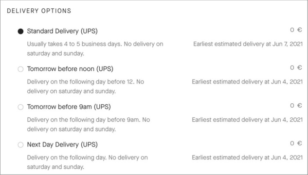
4. Display dynamic delivery dates

How many times have you ordered something online, only to wonder when it might actually arrive? It's a common thought. Show users the exact date or date range it will likely arrive rather than just the generic - it will be delivered within 3 -5 days. It provides real clarity and removes any barriers to buying.
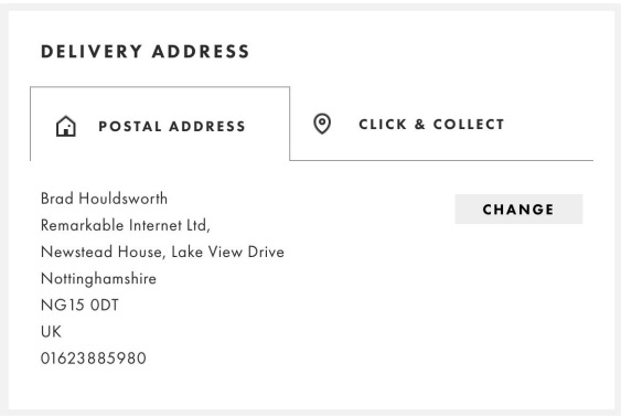
5. Allow direct edit at the review step

A common and frustrating feature for many checkout processes is not allowing you to edit/change any information at the review stage. This means you have to start the process over again - if you decide to even do this. 80% of stores do not currently have functionality that allows customers to change/edit at the review stage. This means many customer who have perhaps accidentally inputted information incorrectly are left very annoyed when they are forced to start this again.
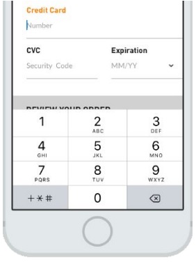
6. Use the correct type of mobile input interface

81% of worldwide checkouts do not use the correct mobile input interface - so consumers are focused on selecting numbers from their full-size keyboard interface instead.
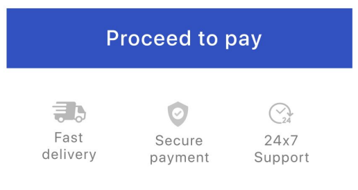
7. Add supportive messages around key CTA’s

When users are ready to buy and commit to the ‘proceed to payment’ button or even ‘pay now’ - ensure you reassure them with some positive language and benefits. For example, ‘secure payment’ or ‘fast delivery guaranteed’. These just help to cement that the buyer is making a sensible choice.
To find out in more detail about how to improve the overall flow for your checkout process - please see Remarkable Commerce's‘Expert Strategies to Boost Checkout Conversion’ whitepaper (updated for 2023). This includes key stats, platform comparisons and lots of top tips and advice on how to avoid basket abandonment.
Want more like this?
Want more like this?
Insight delivered to your inbox
Keep up to date with our free email. Hand picked whitepapers and posts from our blog, as well as exclusive videos and webinar invitations keep our Users one step ahead.
By clicking 'SIGN UP', you agree to our Terms of Use and Privacy Policy


By clicking 'SIGN UP', you agree to our Terms of Use and Privacy Policy
Other content you may be interested in
Categories
Categories

Want more like this?


Want more like this?
Insight delivered to your inbox
Keep up to date with our free email. Hand picked whitepapers and posts from our blog, as well as exclusive videos and webinar invitations keep our Users one step ahead.
By clicking 'SIGN UP', you agree to our Terms of Use and Privacy Policy


